DevSecOps weekly, seventh issue
This was the week when last of the User Experience Design lectures were held, thus I can bring you a brief overview of the subject and gather all what I have learned into a blog post. I would like to thank Telia’s Design Leader Pekka Jääskeläinen for excellent presentations on the subject. Not only because it was such an eye opener for me, but also because he really drove home the balance between what the users want and what the business expects.
User Experience Design
I already wrote a brief explanation of user experience design, which I will be calling UX from now on to keep it simple, on my previous blog post. On it I summarized the UX designer’s position:UX designer lay somewhere in the midpoint between customer and business needs, effectively trying to focus on but not limited on how to make the product as useful, easy to use, credible, desirable and especially add value to both parties involved.
In short; UX is designing what kind of encounter user has with a product or service (just product from now on), and since the magnitude of things influence the experience, various factors must be taken in to the account. On my last blog I also stated that UX is split up in four phases, which are investigate => define => design => develop. Now that I have been user experiencing (see what I did there) all of them, I will go through each phase in greater detail. It is important to remember that UX is first and foremost for planning how to user sees and feels when using the product, thus in software development it ties very closely to User Interface (UI from now on), since it is how the user experiences a computer program.
However, it should be noted that UI is not UX and vice versa, but rather they go hand in hand, but there are differences, which I will present during this post. I will also like to note that modern software development calls for team work and UX teams have designers and developers working together on each of the step. I will go in detail why this is important in this post too.
Investigate
I have said before, that investigation is “do some detective work before rushing headfirst down a cliff” part of a process. Same applies here, of course there is less of a focus on product as a whole, but rather on how and who is going to be using the product. As stated, it is important to find out what are needs of the customer and business, the so-called problem. But how on earth this can be known before even launching a product? For example, certain Finnish mobile phone developer said in the past that users do NOT want a phone that has a touch screen and no physical keyboard.
I see that statement as a good example on why UX is more popular nowadays, since companies want to be on “pulse of their customers” and provide the best they can offer so that they become loyal customers and stay, even though product offered might be a bit more expensive than your competitor. Oh, and to answer the question posed in last paragraph, there are method on finding out what customers wants.
Method is very simple, understand your users. This can be done via user interviews and observation, which in turn helps finding and defining the user personas, stories and cases. All of which help define what users' needs are, thus making the design process much simpler. It is also possible to interview workers who are in contact with customers daily (if available), for example customer support, since this group has closely worked along with the users.
However, this is not all that needs to be done. It is also important to know “your enemies”, by making a competitor analysis. This can be used to find out if something has been done before. Of course, this doesn’t mean that something that has been already discovered, should not be done. Rather, it is a signal that something must be done better for your UX to be better than competitors. A tool to this is benchmarking, which is figuring out if something like this has been implemented somewhere.
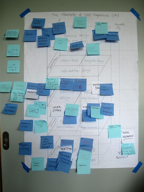
Here is one example of an investigation done using post-it notes. Image by visualpun.ch. Image source here:

Define
After investigating what the problem looks like, it is time to start defining wherein the problem lies. This can be tackled with questions such as:
- What the problem is
- Who encounters the problem
- Where the problem is encountered
- When the problem is encountered
- How many times the problem occurs
- What causes the problem
- What the problem causes
In short, they define the problem in hand even further, turning abstract in to more concrete. I remember doing this short of things when working at call center. If we encountered an error in design, for example user could not change something on self-service web-portal. Almost all the same questions where present. The goal was to find where the problem lies and write down a report on what systems we have checked and what was the expected result and what happened instead. If this kind of analysis would not have been done, the problem would still have been like the customer would have put it “it doesn’t work”, which is very undefined to something that is much more tangible.
When above questions are answered, the real problem can be solved, thus it also minimizes risk of designing something, that is not necessary. It is important to start finding what are the design drivers that push forward the UX process. Design drivers are key elements which govern the design of the project. For example, during investigation it is discovered, that users want to use their handheld devices to be able to manage your product when they cannot access their home desktop, via a mobile app or web app that allows users to access the product without needing to use the desktop application.
Key design driver on above case would be development of such app, because there is demand for it and market statistic show, that almost every one of our customers has a handheld device.
Design
Designing is same as generating an idea on how to solve the defined problem. I already talked on Service Design post about brainstorming, meaning such throwing ideas to the wild. I learned about a new way of doing this, which is brainwriting.Brainwriting is a team effort, in which each member of the team writes down the defined problem to a piece of paper and then, on that same paper, write down three proposed solutions. The solutions are written in set time limit and after the time is over the piece of paper is passed down to next team member.
The team member who receives the piece of paper with solutions then starts either refining the ideas the last person has written down or writes down three more, with same time limit. This is then done three more times. After the same paper has been written on five times, it is time to look at the papers and see what kind of ideas where discovered.
This listing usually has very raw ideas because of the limited time, meaning it is a good idea to discuss each solution more thoroughly. Since it helps flesh out the ideas even further. Often there are multiple good answers for the problem, thus in brainwriting the best one is picked out by voting.
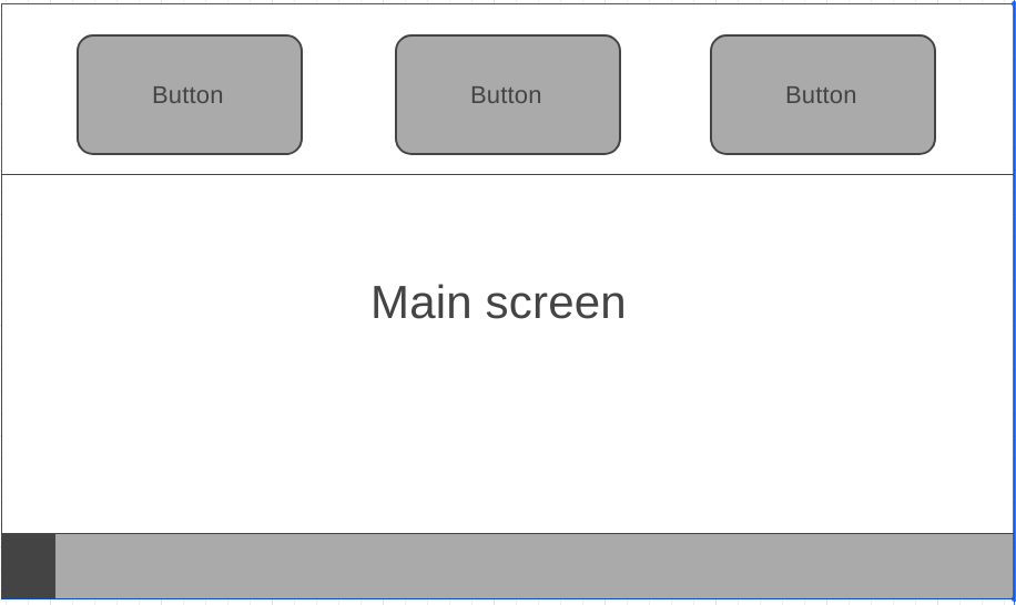
When the solution is found, it is time to start planning what the solution will look like. Since this is UX the focus is on the look and feel of the software, thus a mockup (also known as wireframe) of a UI will be drawn. What it is, is a very simple draft on how the user interface will look like. It can be on a piece of paper or done with a software such as Wireframe.cc.
Here is one example of a mockup:

Again, like with brainwriting, several mockups can be drawn by each member of the team. What usually happens that there are many perspectives on how the UI should look like, since UX designers may have their own vision of the solution. For this, it is recommended to be agile and combine best elements of each mockup to form one super design. It is an utmost importance to present mockups to the users and gather feedback from their views to improve design. Being agile means also that design can also be done in iterations, where elements are made even better by each step, when the general idea on what the best design path is from gathered feedback.
While mockup of how the user interface should look like is important, it is also good idea to plan how the product is architected. What this means is think on where different elements of the product are going to be located, how navigation is arranged, etc. Basically, it is like a site map for upcoming product. When UI mockup and information architecture are complete, next up is the final phase of designing, building a prototype.
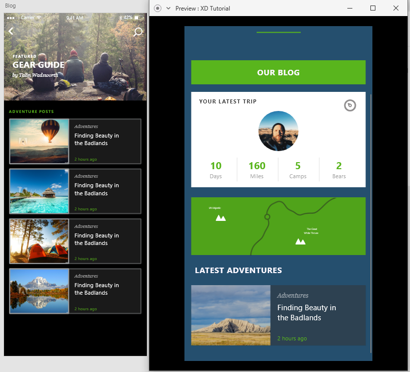
A prototype is a program with graphical UI, that doesn’t have any backend functionalities, sort of like a proof of concept for the program. When prototyping it is time to move outside of simple drafting that shows where a button should be located to a full-fledged view on how to program will look when it is fully developed. This is no longer done with pencil and paper but rather with special tools, such as Adobe XD and Sketch.
Here is a screenshot on how advanced prototyping XD can do:

As can be seen, it looks almost like a real finished program, in Preview-mode the buttons can be clicked, and the program responds by showing what that press does. This is very powerful and yet again, can be presented to user who at this point gets a clear idea on what the UI is going to look like, how it is navigated etc. and give feedback. All this even before any lines of code has been written! Think of the amount of time and money saved because of these awesome tools!
Develop
We have come so far and like said, without ever needing to write code. However, now is the point where the so called “handover” happens and it is time to start building the product. However traditional waterfall model is not in effect here, and thus handover doesn’t mean that a designer simply drops all the design material to the lap of a developer and hope for the best. These times need to be over in order to have excellent UI/UX. Developer must be part of the design all this time, so that there is understanding on what the designer wants the developer to develop. Vice versa, there might need to revision the design when programming proves some design idea to be non-plausible in the scope of the project.
Thanks to modern technology there are tools for an easy handover of design to developers, even going so far that there is automation of programming when design is exported from the program! This is possible via collaboration apps for designers and developers, such as Zeplin. Like said it automates to process by generating development resources automatically, such as style sheets for webpage or XML for Android development.
What’s next?
Well now that design is done and developed to release state, the moment of truth is upon us. Final release happens, letting users experience the product. However, like with any modern software development, the story doesn’t end there. Post-release UX needs evaluation with available indicators. These include, but not limited to, ease of use, does the solution really solve problem and if the program is clear enough so that user wants to use it.
As with everything there are tools for collecting data for these indicators, such as A/B-testing and Net Promoter Score, in short NPS. For example, A/B-testing shows two different version of the ready product (different in a sense that they have slight modifications, such as different colored buttons etc.) to each user. Hence the name A/B for A-version and B-version. The design of UI is changed depending on which version gathers better customer behavior. For example, if version A proves that green “buy”-button makes users more likely to buy a product from web-store than version B’s orange button, then the version A is implemented to the all users of web-store in the future. In short design is honed from
Beauty of A/B testing is the fact that every part of UI can be tested this way through iterations. One week you gather information on which color the button should be, next week how long the form should be, next week on amount of graphics, etc. Finally, trough small iterations the product’s UX is honed to perfection. Sounds familiar? Again, this same pattern is noticeable at almost every step of modern software development in which the product is developed through small iterations (sprints), rather than finishing whole product in one go.
With NPS there is the ability to collect feedback with question “How likely are you to recommend [COMPANY] to a friend or colleague?”. As can be seen the question is focusing to the company, rather than something tangible. NPS gives out a score to evaluate how good the company is, but on my experience in a call center, it is more important to focus on what the feedback is concerning. If there is no mention of difficult to use UI or terrible way on how the user is treated when using the product, then there is no need to tweak the UX. Kind of like in the beginning when investigating, focus on what the user expectations are and develop a user story, case or persona from there and start from there.
So rather than blindly following a number, I’d personally go with A/B-testing followed with the question and if there is feedback, start developing from there.
My thoughts
As I stated at the beginning, this course was a definite eye opener for me. I understood the importance of planning things out, before implementing them. BUT because of my history with working closely with customers made me worried that if design is hugely influenced by customers, then the result would not be very beneficial to the company.
However, I quickly learned that UX is not only defined by customers but rather there is a fine line of meeting customer’s expectations, all the while fulfilling the needs of the business. I even asked from the lecturer, that since customers can demand so much from company, how it is even good idea, in the business sense, to start fulfilling all of these.
I quickly learned that UX is not blindly obeying what the customer needs but rather finding the solution that satisfies both parties. It is finding that sweet win-win situation by perfecting what majority of users need while making product more accessible, easy to use and most importantly desirable for user to spend money on.
I also like to admit that coming from open source background (trying to use as many open source projects as possible), I felt that it is a very dumb idea to limit what user can do with a product, simply because you want to build beautiful UI. This is because open source projects usually come in the mindset of the backend first and then someone will, hopefully, design a user interface to this.
While I still believe that this should be the case in programs that are used by professionals, such as compilers, IDE’s, etc., I came to realization that this is not the case for every user interface in the market. Just like programming languages are tools, that are picked upon what the need is, so are apps developed for the user's certain need. Some are beautiful, easy to use and offer no customization, because there is no NEED to be customizable, since it has been honed down to perfection that suits the company's need.
UX is all about finding that win-win situation described above.
-sorhanp